
Article · AI Visuals & Video
AI Realism: How Real Can AI Advertising Get?
Four industries, thirty images and one short film. I directed, generated and finished all of it myself, to show by example where AI realism stands today.
By Ero Mesropyan · designer0 · November 2026 · 10 min read
Jewelry, fashion, sportswear, food. Every image in this article is AI-generated.
Every picture on this page looks like it came out of a camera. None of them did.
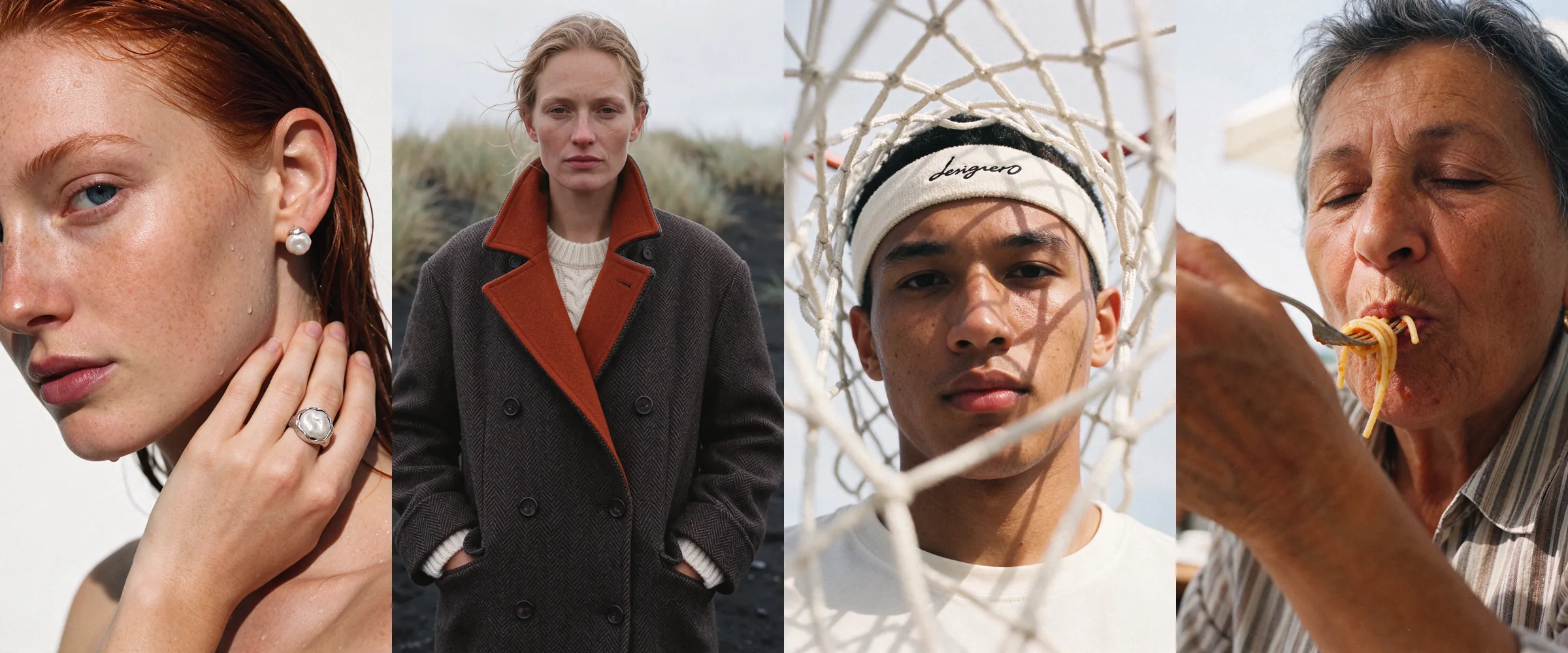
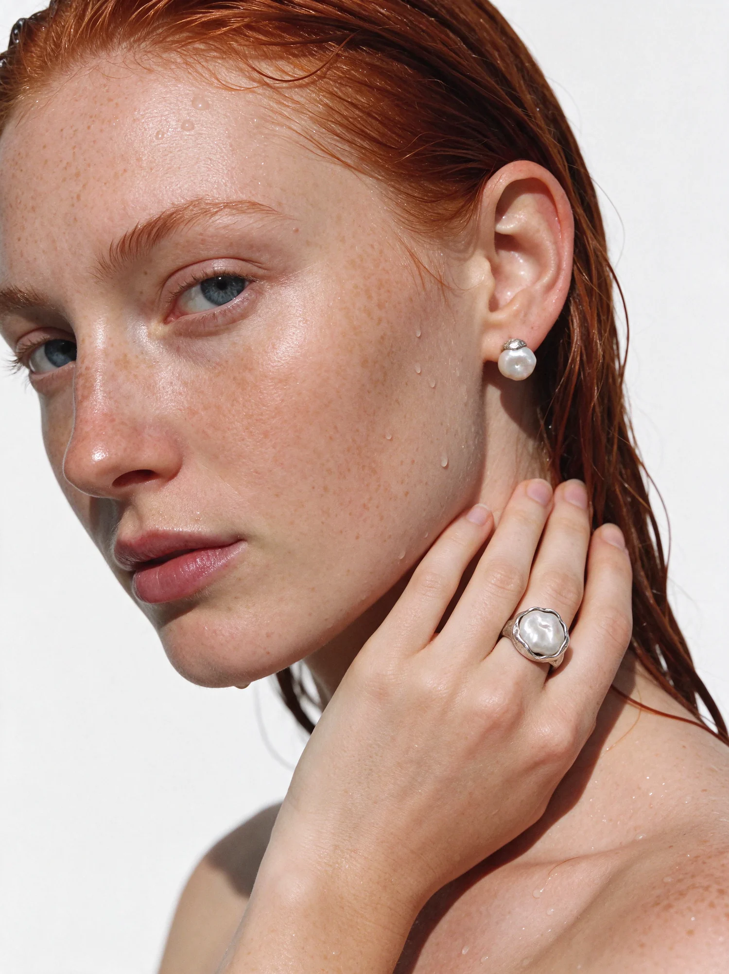
There was no photographer, no studio, no casting call, no location permit and no stylist. The woman with the wet red hair, the coat on the black beach, the boy behind the basketball net and the long lunch in the sun were all generated, then selected, corrected and finished by hand. I made them as a test with one question behind it: if a brand asked for a campaign tomorrow, how close to real photography could AI take it?
My answer, after this project, is close enough that I stopped asking whether AI can do it and started asking who is directing it.
I chose four industries that live on photography: food, jewelry, fashion and sportswear. Each one is difficult for a different reason. Food needs appetite, which is harder to fake than it sounds. Jewelry needs the same object to survive from frame to frame. Fashion needs fabric to behave like fabric. Sport needs energy without clichés. Below I go through all four, show the details up close and explain what made the difference.
01What "real" means
The first thing this project taught me is that realism has very little to do with sharpness. AI images have been sharp for years. They were sharp and still wrong, and most people could feel it within a second, even if they could not say why.
What gives a generated image away is usually its politeness. The light comes from everywhere and nowhere. The skin is even. The face is symmetrical and pretty in a way no casting director would bother with. The subject sits in the middle of the frame and nothing is out of place. It looks like the average of ten thousand advertisements, because that is what it is.
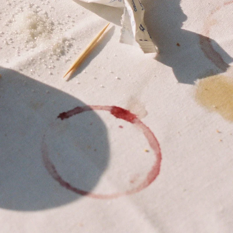
Real photographs are full of decisions and accidents. The sun is in one place, so the shadows fall one way and they are hard. Somebody's hand is in the frame because it was there. A glass leaves a ring on the cloth. Skin has pores, freckles, small veins. A photographer stood somewhere specific and chose to shoot through something, or from too close, or a moment too late.
So I set four rules for the whole project.
- One light that makes sense. If the scene is noon, the shadows are short and sharp, on everything, in the same direction.
- Faces with character. Nobody in these pictures was chosen for being pretty. They were chosen for looking like someone.
- One photographic idea per frame. A reason for the picture to exist beyond showing a product.
- Traces of life. Crumbs, stains, sand, sweat, creases. The things a careless retoucher removes and a good one leaves alone.
 Detail · 100%
02How each set was built
All four sets followed the same order, and it is much closer to a photo production than to typing a sentence into a box.
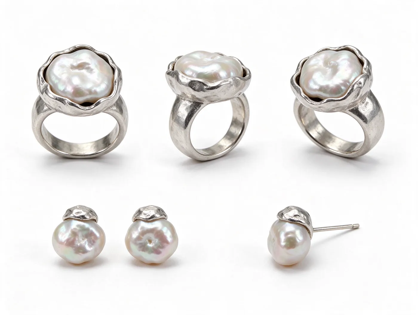
First the product. Before a single person appears, the object exists as a reference sheet: the ring from three sides, the coat from the front, the back and open. Everything generated afterwards is tied to that sheet. This is how a pearl keeps its shape across six pictures.
Then the world. One location, one kind of light, a narrow palette. A white wall in noon sun. Black sand under cloud. Open sky and hard daylight. A table under the trees. Limiting the world is what makes a group of images read as a campaign instead of a collection.
Then casting, which takes longer than anything else. I describe people the way a casting brief would: age, build, and what is unusual about the face.
Then the shot list. Each frame gets one idea and one job in the set: the portrait, the detail, the product alone, the wide. If two frames do the same job, one of them goes.
And then selection, which is most of the work. For every image here there are many that did not make it. Some had obvious errors. More often they were simply fine, and fine is the enemy in a project like this.
03Food: one long lunch
I start with food, because it is the set that also became a film.
Food photography usually means the hero dish, lit like jewelry. I wanted the opposite: one long outdoor lunch, shot the way a friend with a good camera would shoot it.
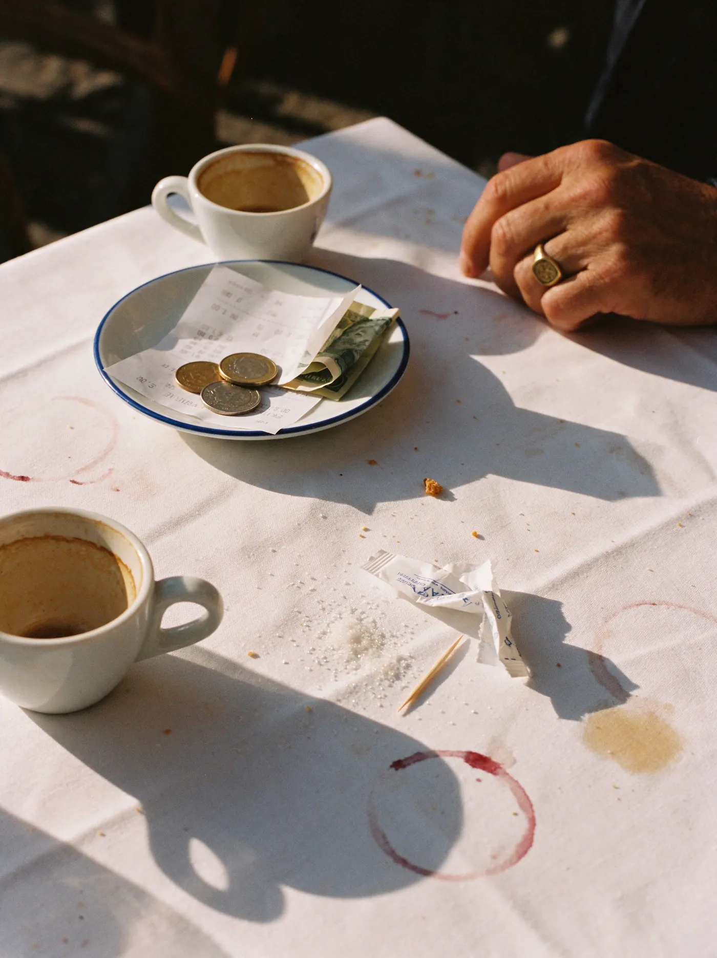
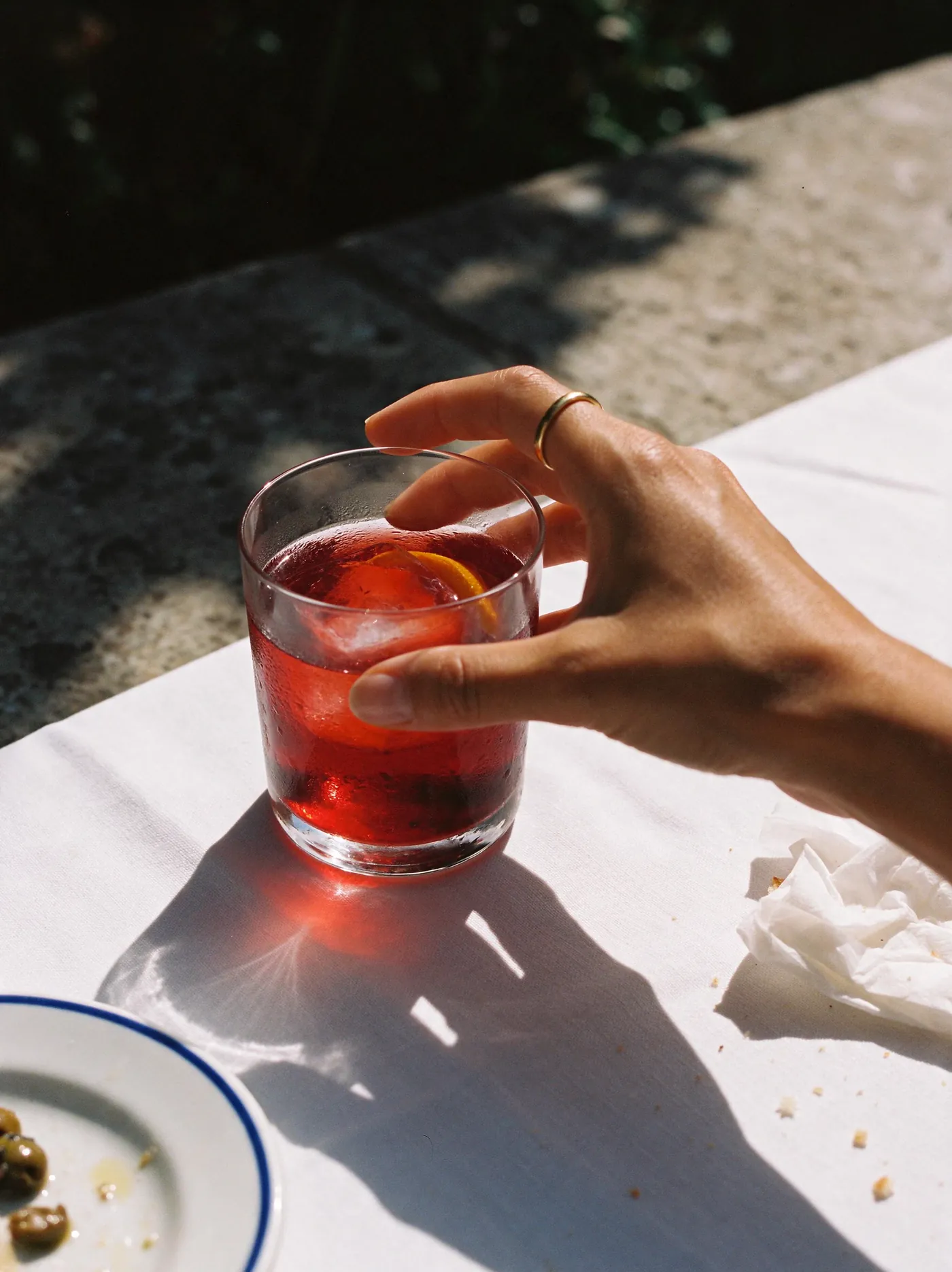
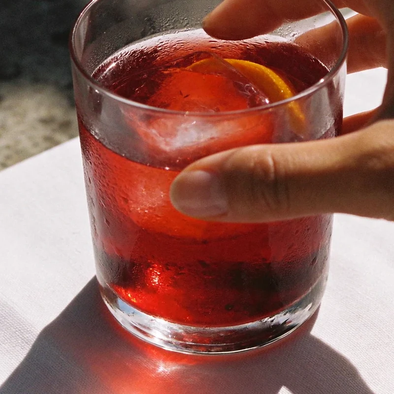
The whole set lives on a single table. White cloth, blue-rimmed plates and hard midday sun, the kind that turns a glass of water into a lens. Twelve frames follow the afternoon from the kitchen to the bill: tomatoes on a cutting board, a negroni, pasta, oysters and lemon, bread wiping a plate clean, wine being poured, the cook taking five minutes against a wall with his eyes closed, a dog under the table, coffee, coins on a saucer and, at the end, the table alone, wrecked and happy.
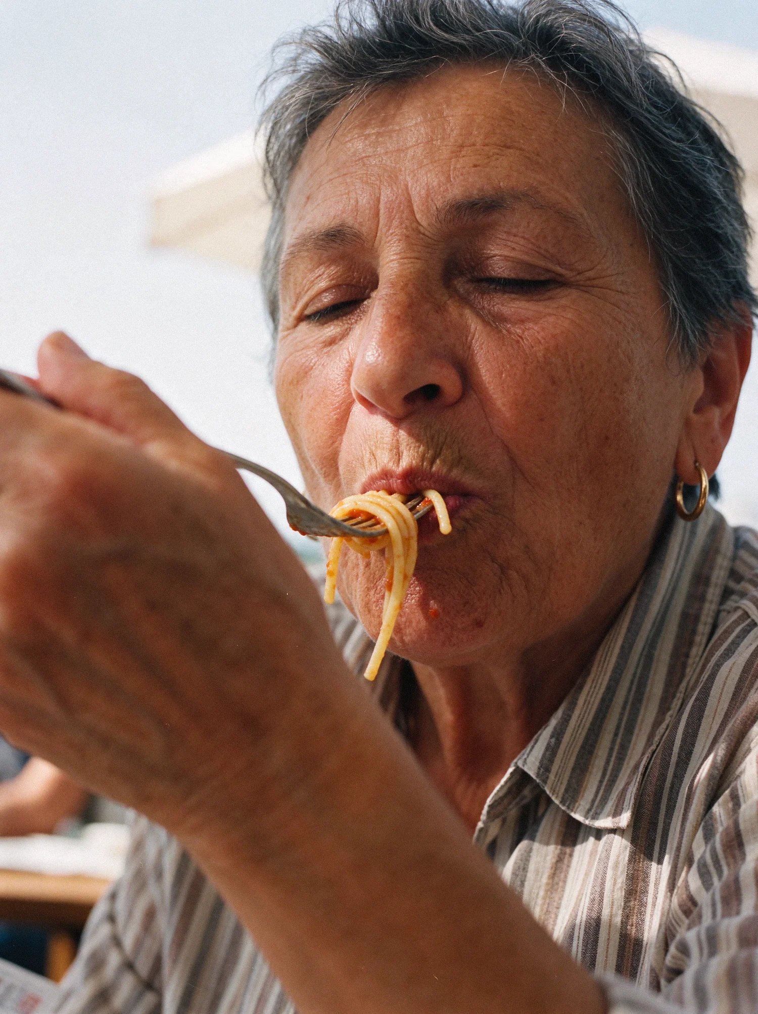
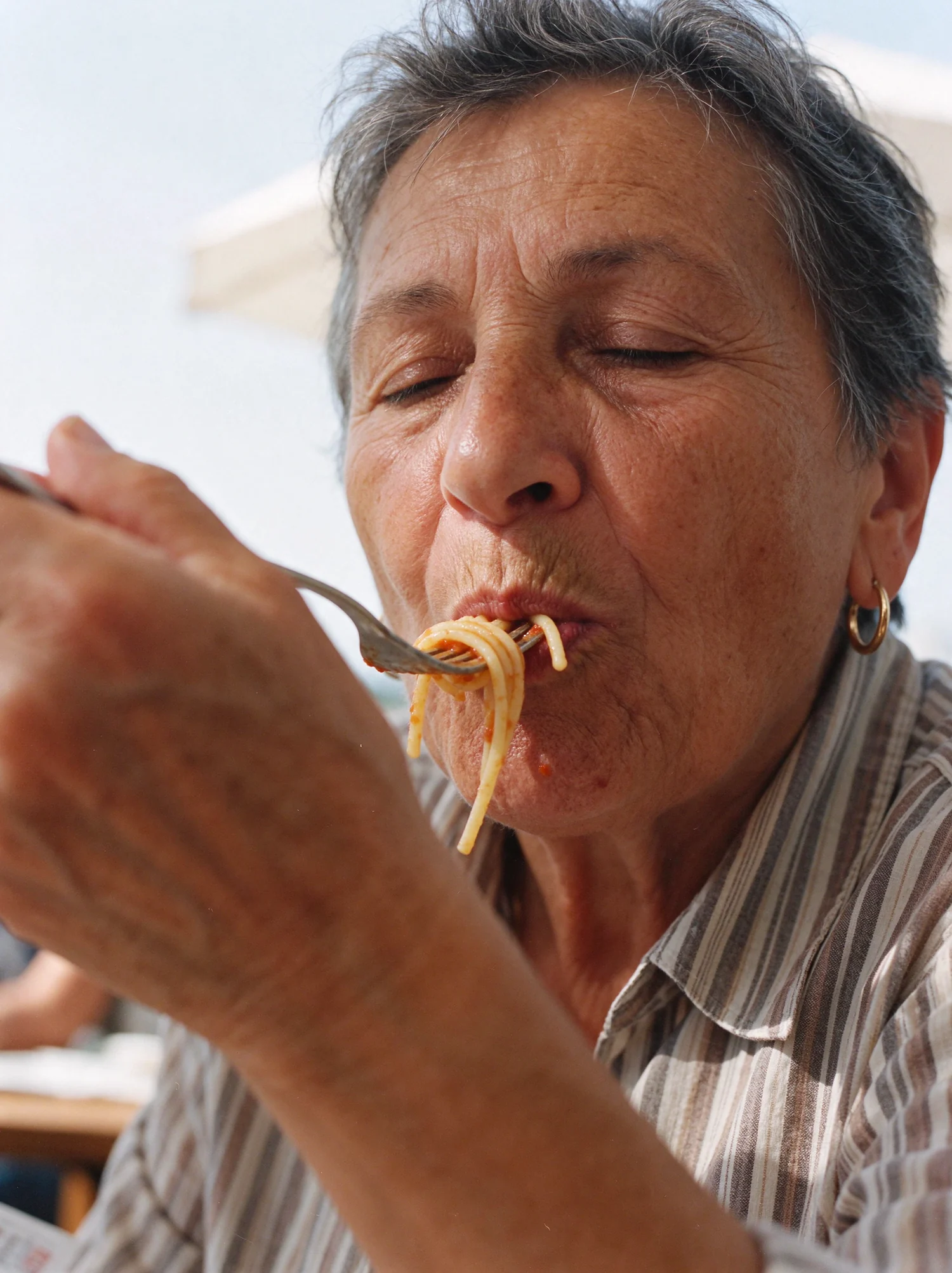
This is the set I would show to anyone who still thinks AI images are cold. A woman eats spaghetti with her eyes shut. Another disappears behind a slice of watermelon. A man squeezes a lemon over oysters and squints, because the juice went where juice goes. Nobody is posing. The food is half eaten in most frames, which is exactly why you believe it.
 Detail · 100%
04La vita felice: stills and film as one campaign
The food set was made the way a real production treats a shoot day: stills and film from the same table, in the same light, with the same people. A lunch is an afternoon, and an afternoon needs time to pass. The photographs give you the faces and the details. The film gives you the order of things.
It is called La vita felice and it runs for thirty seconds. It opens on a white cloth being thrown over a bare wooden table. Plates go down, then glasses, then wine. People arrive and the cloth starts to collect evidence: a splash of red, crumbs, sauce, rings. By the end everyone has gone and the camera stays with what is left. Then the text comes up.
Happiness is not found in a clean tablecloth, but in the marks we leave upon it. At the beginning, it was white. Beautiful, but empty. In the end, it was stained. But full.
The tablecloth is the main character. I built the story on it because it makes the idea of this whole project visible. The stain is the proof of life.
Video is harder than stills, and by a wide margin. A photograph has to be right once. A shot has to stay right for every frame of its length. Hands must keep their fingers while they move. Wine has to pour like a liquid. A face has to remain the same person from the first second to the last, and the sun cannot change its mind between two cuts. Then every shot has to match the stills, so that the man with the lemon in the film is the man with the lemon in the photograph.
None of that is impossible. All of it is achievable if you work patiently and professionally, the way the job deserves. It takes many attempts per shot, a clear picture of what you are waiting for, and the discipline to throw away a take that is ninety percent right. I cut the film myself, set it to music and added the titles. It is the best piece of video I have made so far.
05Jewelry: the same ring, six times
Jewelry is the most technical of the four, because the product has to be the same object in every frame. A ring that changes shape between two pictures is a mood board, and nobody can sell from a mood board.
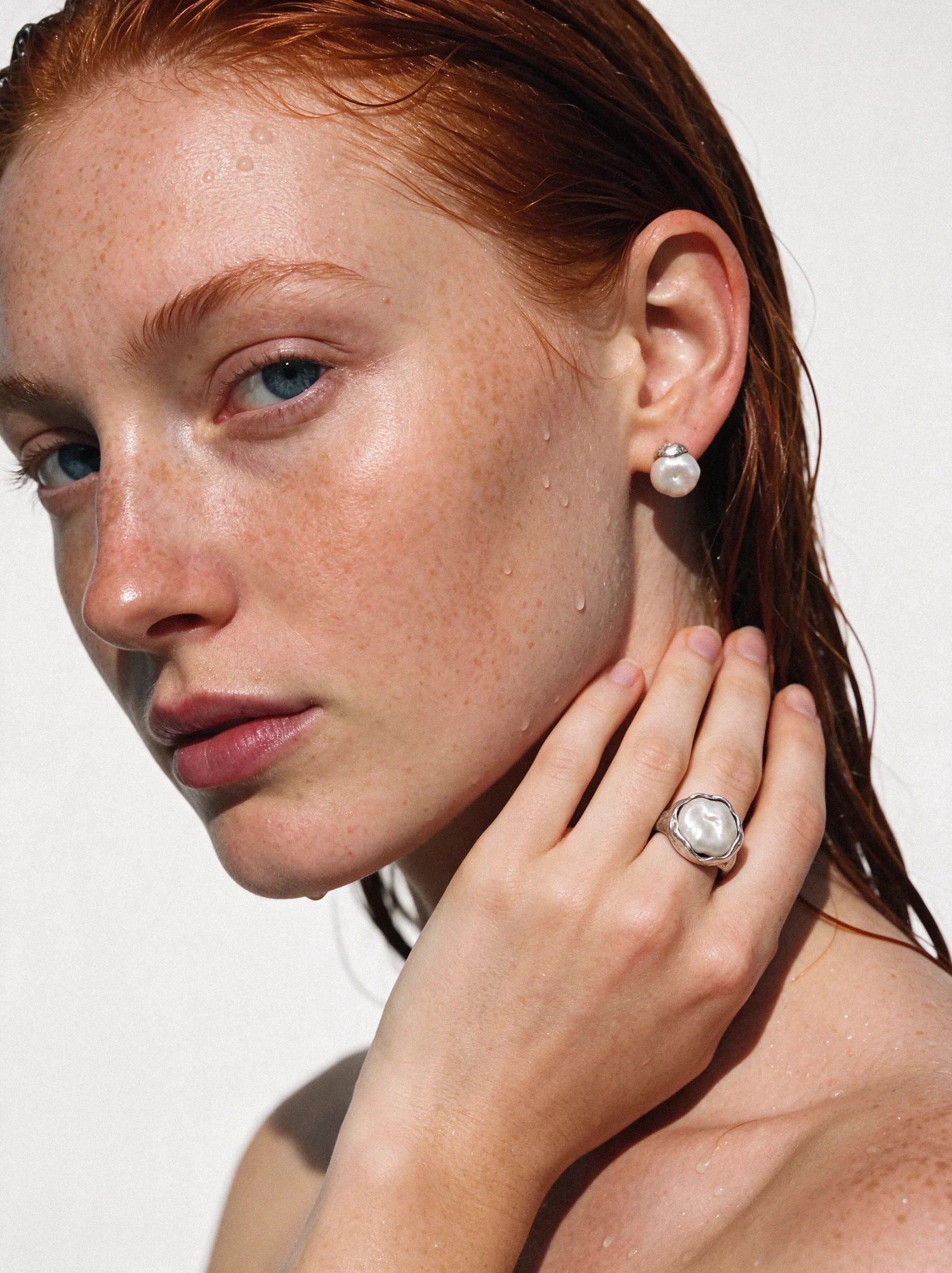
So the jewelry was made before the models. I designed one ring and one pair of earrings, a baroque pearl held in hammered silver, and generated them as a clean product sheet. That sheet became the reference for every other image in the set. The models changed. The ring did not.
Then the casting. The first instinct, mine and the software's, was a beautiful young brunette. I threw her out. She looked like every AI model on the internet. The set became good when I cast three women who have nothing in common except presence: a freckled redhead, a dark-skinned woman with close-cropped hair, and a woman in her forties with her hair pulled back and no interest in being liked by the camera. Wet skin, a white wall, hard sun. Nothing else.
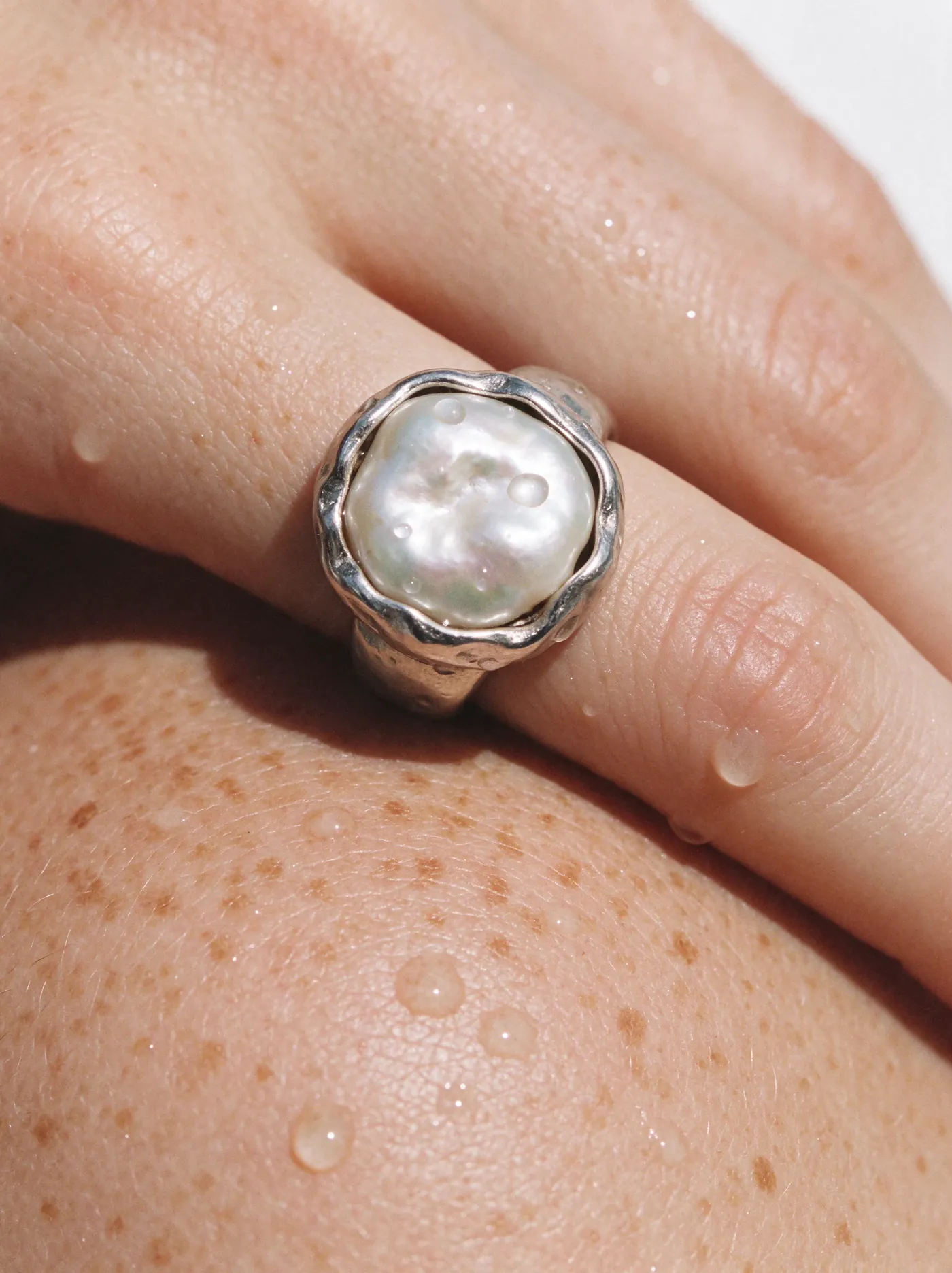
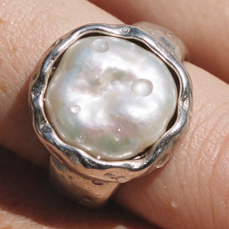
The other three frames do the product work: a macro of the ring against a freckled shoulder, a hand, and the ring half buried in wet sand as the water pulls back. That last one replaced a tidy still life on a stone, which I rejected for being exactly what you would expect.
 Detail · 100%
06Fashion: one coat, three people
Fashion asks a different question. Can one garment stay itself on different bodies, in different poses, in weather?
I built the set around a single coat: dark herringbone wool, double-breasted, with one detail that makes it recognisable from across a beach. The underside of the lapel is rust orange. As with the ring, the coat existed first as a reference sheet, with the front, the back, the open collar and a close-up of the weave and the button.
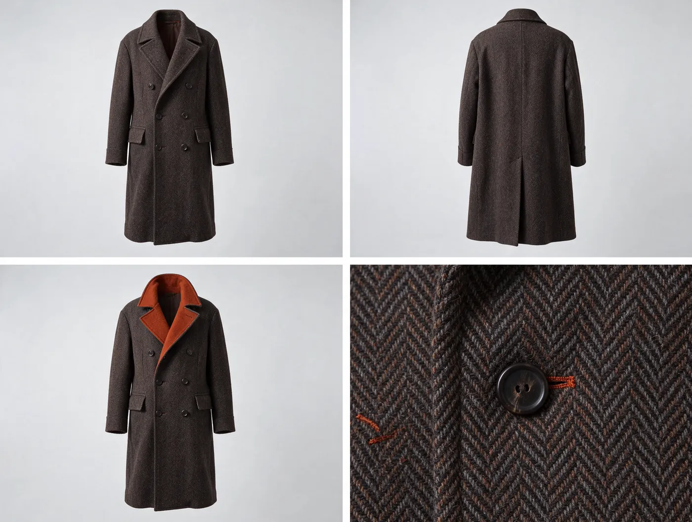
Then it went to a black sand beach under a flat grey sky, on three people: an older man walking into the wind, a woman with the collar turned up, a young man with a shaved head sitting on driftwood. Same coat, same orange, same buttons. Between them are three frames without a face. The coat hangs on a fence post. A hand holds the button. And in my favourite frame of the set there is only the hem, the trousers and a pair of worn black boots sinking slightly into wet sand.
Overcast light is unforgiving in its own way. There are no dramatic shadows to hide behind, so the fabric has to carry the picture. Wool has to look like wool.
07Sport: the idea before the product
Sport is where I failed first, and it taught me the most.
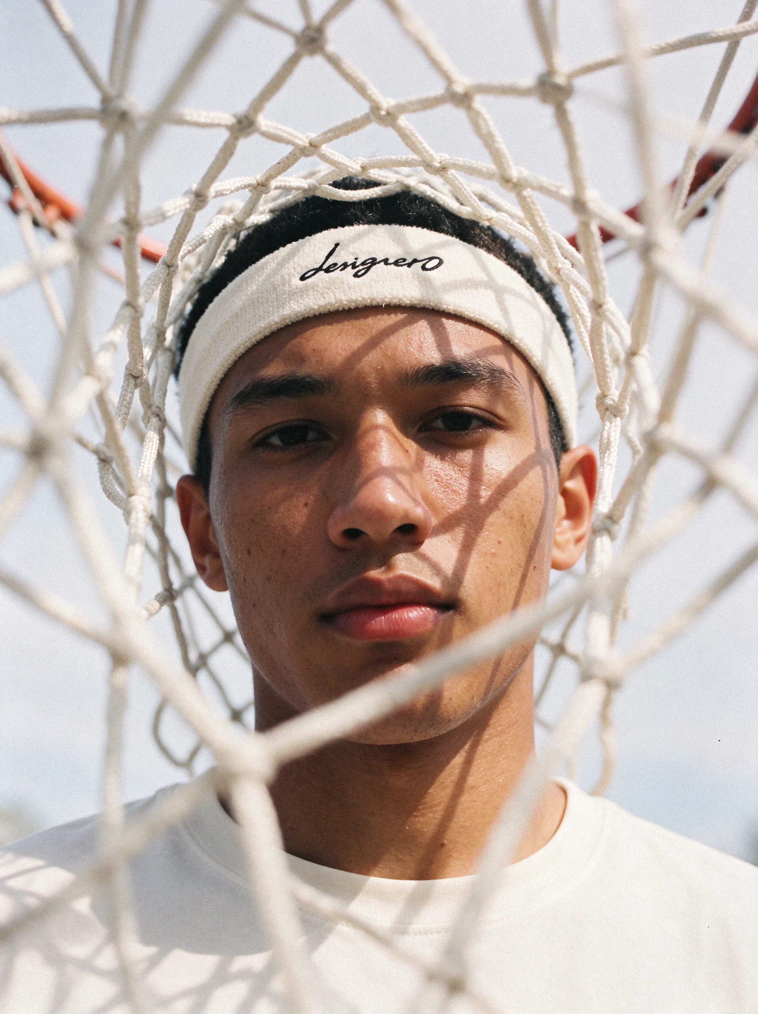
The product was simple: a training top, a headband and a wristband in off-white, carrying my own designer0 mark. The first portraits came back technically perfect and completely dead. Athletes standing in good light, looking at the camera, wearing the product. A second attempt, more dramatic, was worse. Both had what I can only call the AI look, and it had nothing to do with the people. It was the angles and the lighting. Standard, static, safe.
I went back to real sports photography and looked at what the good photographers do. The picture is almost never about the product. It is about one idea. So I rewrote the brief for myself: this is a set of photographs that happen to contain a product, in that order.
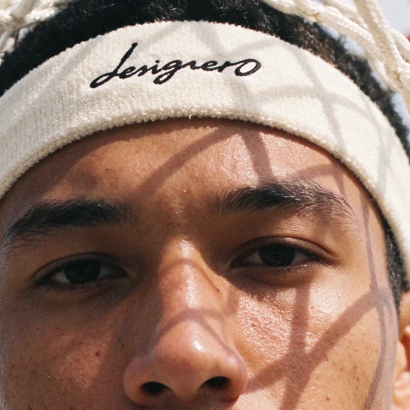
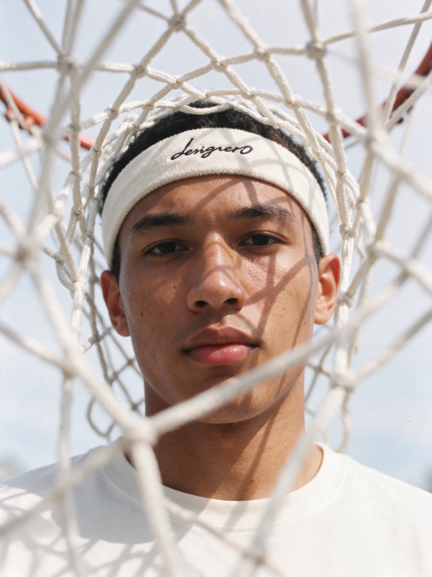
The frame that unlocked it was the basketball player shot through the net. The net is out of focus in the foreground, its shadow falls across his face in hard daylight, and the headband is simply there, where a headband would be. After that, every frame had to earn its place the same way: a boxer grinning through the ring ropes with an orange mouthguard, an older runner shading his eyes with his wristband hand, a table tennis ball held over one eye, a cyclist seen through the spokes of a wheel, a girl on a teammate's shoulders.
One more note on faces. In an early group shot the athletes looked generated, and it took me a while to see why. Their faces were too even. Athletes do not have evenly proportioned faces. They have heavy brows, noses that have met an elbow, ears that stick out. Once the casting allowed for that, the pictures relaxed.
 Detail · 100%
08The last ten percent
Generation takes an image most of the way. The rest happens in Photoshop, and it is the part people skip.
A raw output, even a very good one, is slightly too clean. The tones are a little flat and the surface is too smooth, as if the picture had been printed on plastic. So the final images get what a photograph would get from a retoucher, only in reverse. I do not remove texture. I put it back: film grain, a little more local contrast so that skin and fabric have bite, warmer and less even colour, deeper blacks where the picture needs weight.
Drag the sliders. On a phone the difference is subtle. On a large screen or in print, it decides whether you accept an image or start to question it.
 GeneratedFinished
 GeneratedFinished
 GeneratedFinished
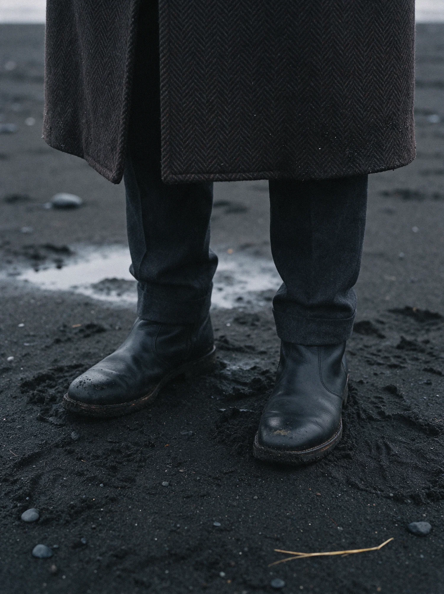
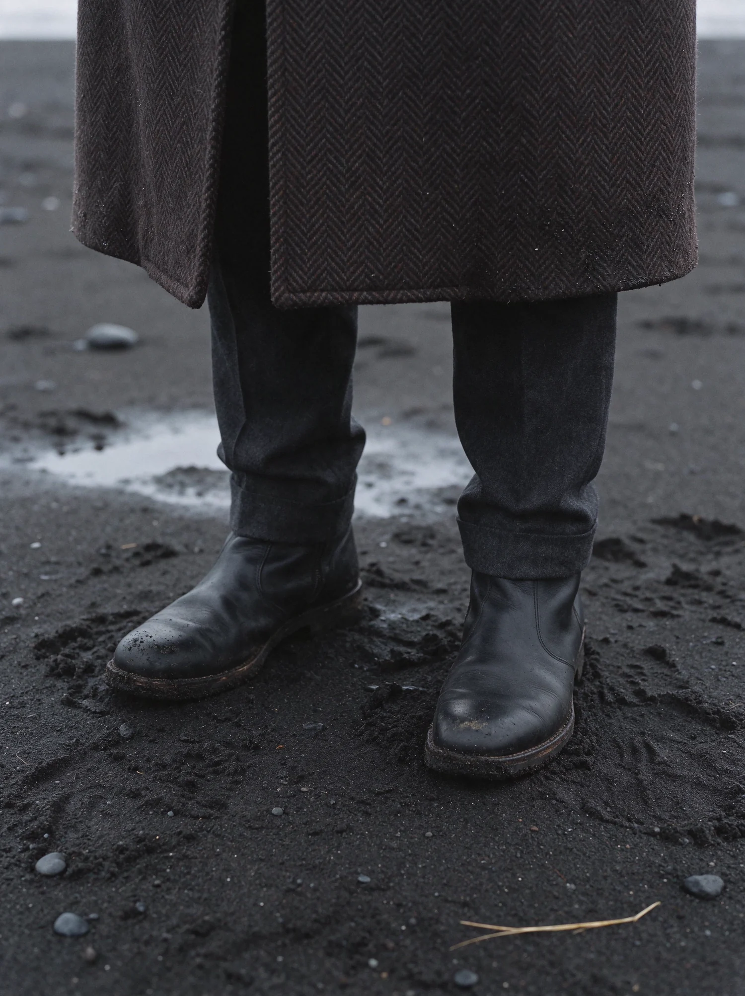 GeneratedFinished
09What this means for brands
I do not think this replaces photography. A real person wearing a real product in a real place has a value that nothing else has, and for many brands it always will.
But a great deal of commercial imagery was never about that. It is about a product, a mood and a deadline, and for that kind of work the arithmetic has changed. A campaign that once needed a location, a crew, a cast and weeks of planning can now be developed in days, tried in several directions before anyone commits to one, and extended later without calling everybody back. A small brand can afford the look of a big one. A big one can try ideas it would never have paid to shoot.
What has not changed is the part that was always hard. Somebody has to know what a good picture is. Somebody has to cast the face, choose the light, reject the versions that are almost right and recognise the one that is. The tool generates. It does not decide.
That is the work I do, and everything on this page is my answer to the question in the title. If you are planning a campaign and want to see what it could look like before you book a single day of shooting, write to me.
Your campaign next?
Want visuals like these?
AI films, product shots and campaign key visuals, made to your brand and ready to publish. Tell me what you are launching and I'll get back to you within 48 hours.
or write directly[email protected]
Toolkit: Seedream 5.5 for stills · Seedance 2.5 for motion · Photoshop for finishing · CapCut for the edit · Suno for the score